Overview
Zara is a huge international fashion brand that is incredibly popular, however, their online shopping experience can be very frustrating for users. Both the designs of their shopping pages as well as the photography on their site make it very difficult to successfully browse and purchase items. The system has had a negative impact on the amount of people shopping online. Because of this, I decided to redesign Zara’s responsive web app to provide an easier and clearer process of online shopping. The app was designed with a mobile-first approach.
My Role
End-to-end UI/UX Designer
Tools & Skills
- Paper wireframing
- Sketch
- InVision
- Proto.io
Duration
2 month project
User Insight
The 5 W's
Who: Online shoppers in the US, primarily aged 18-40.
What: The responsive browse and check-out process system used for Zara.
When: The system will be used anytime a user wants to shop for clothes or accessories from Zara without going into the store.
Where: At home or on the go, on various devices.
Why: So more people can purchase clothing from Zara.
What: The responsive browse and check-out process system used for Zara.
When: The system will be used anytime a user wants to shop for clothes or accessories from Zara without going into the store.
Where: At home or on the go, on various devices.
Why: So more people can purchase clothing from Zara.
User Stories
- "As a user, I want to easily browse items online, so that I can find what I’m looking for."
- "As a Zara shopper, I want to clearly see various angles of an item, so that I can feel
comfortable committing to purchasing."
comfortable committing to purchasing."
- "As a user, I want a way to quickly view an item and add it to my cart, so that I can speed
up the shopping process."
up the shopping process."
- "As a user, I want to purchase items online to be shipped to my home, so that I can receive
my items without needing to go anywhere."
my items without needing to go anywhere."
Reasons for Redesign
- Confusing navigation
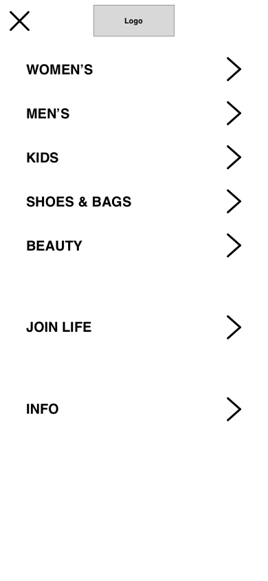
- Unclear menu options
- No grid system on browsing pages
- Photography that does not clearly show items
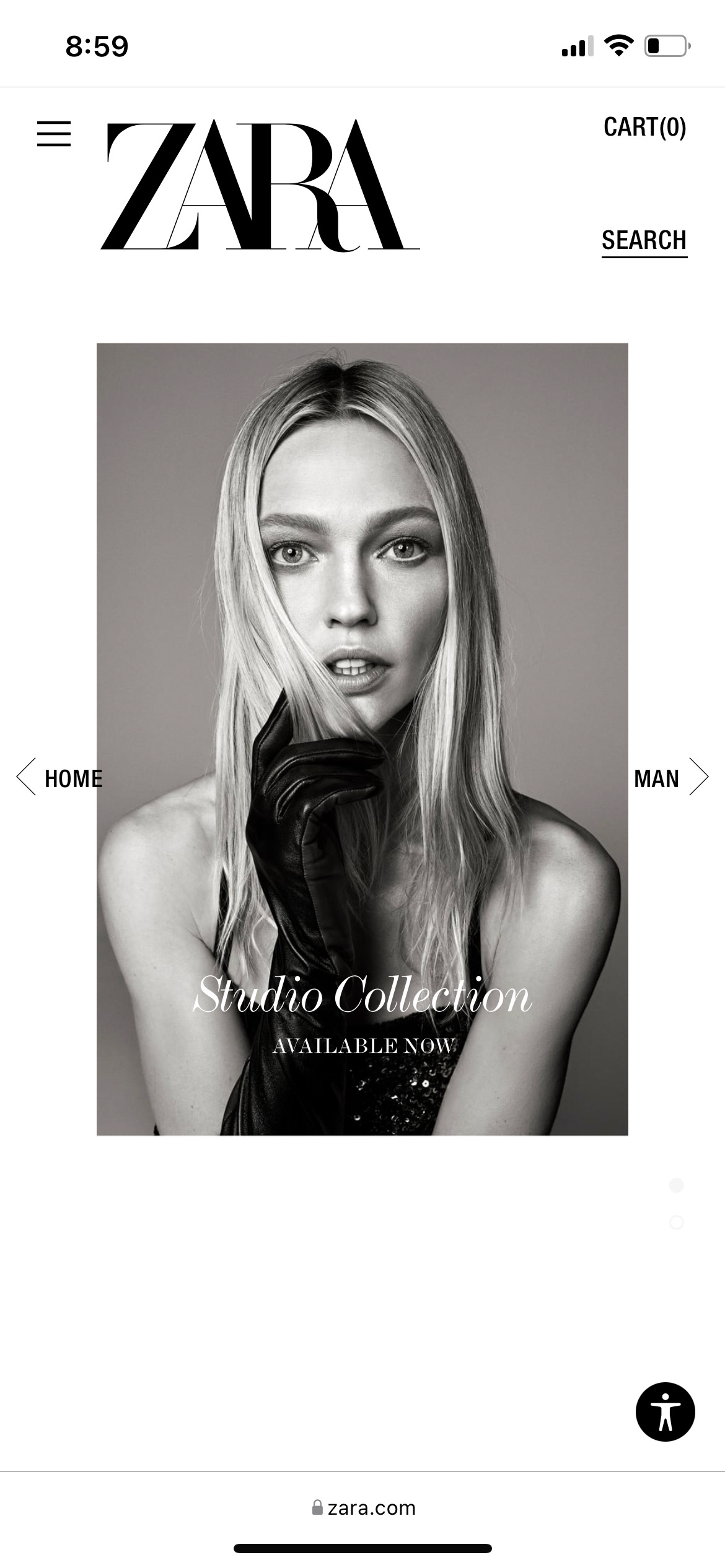
Homepage does not exemplify the brand and buttons are not where users may expect them to appear
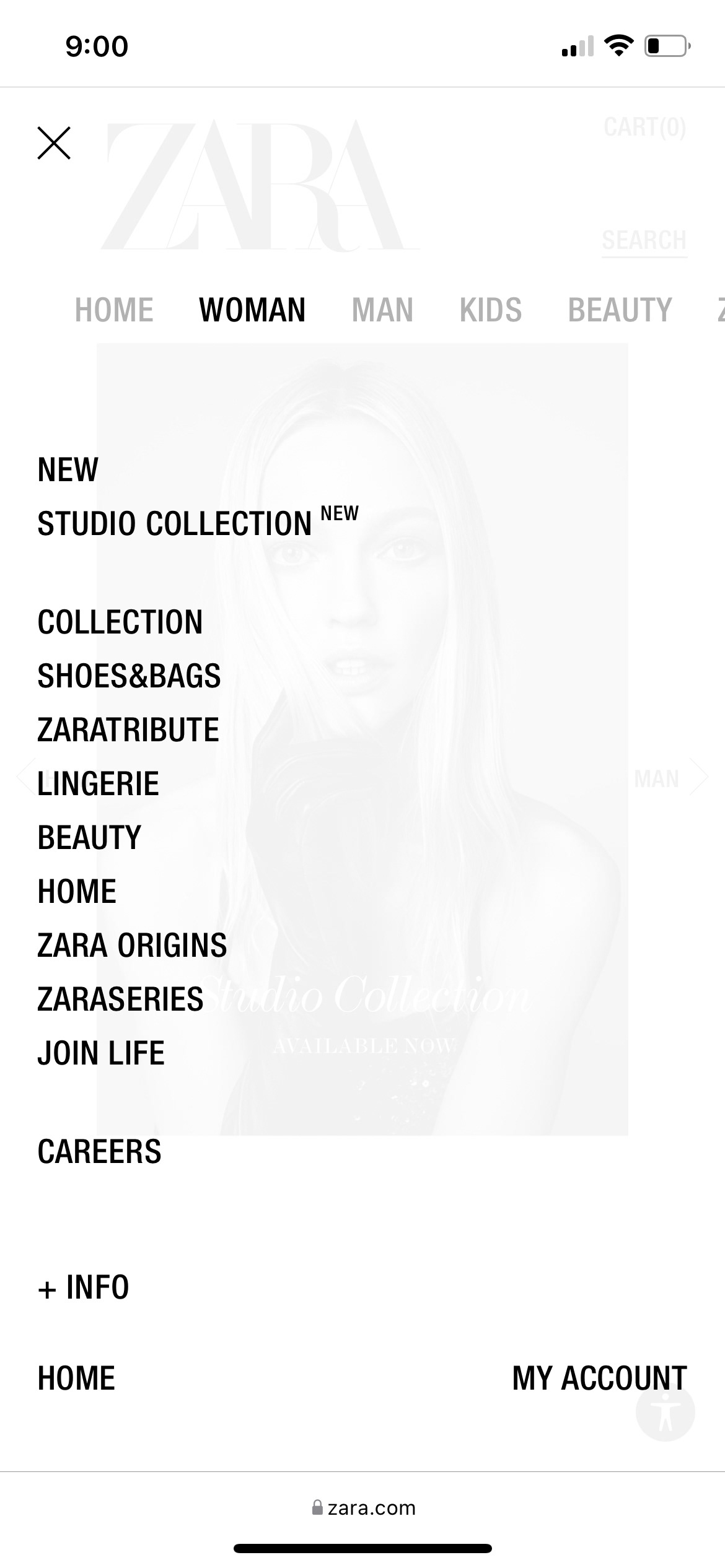
The browse menu is long and categories are often unclear

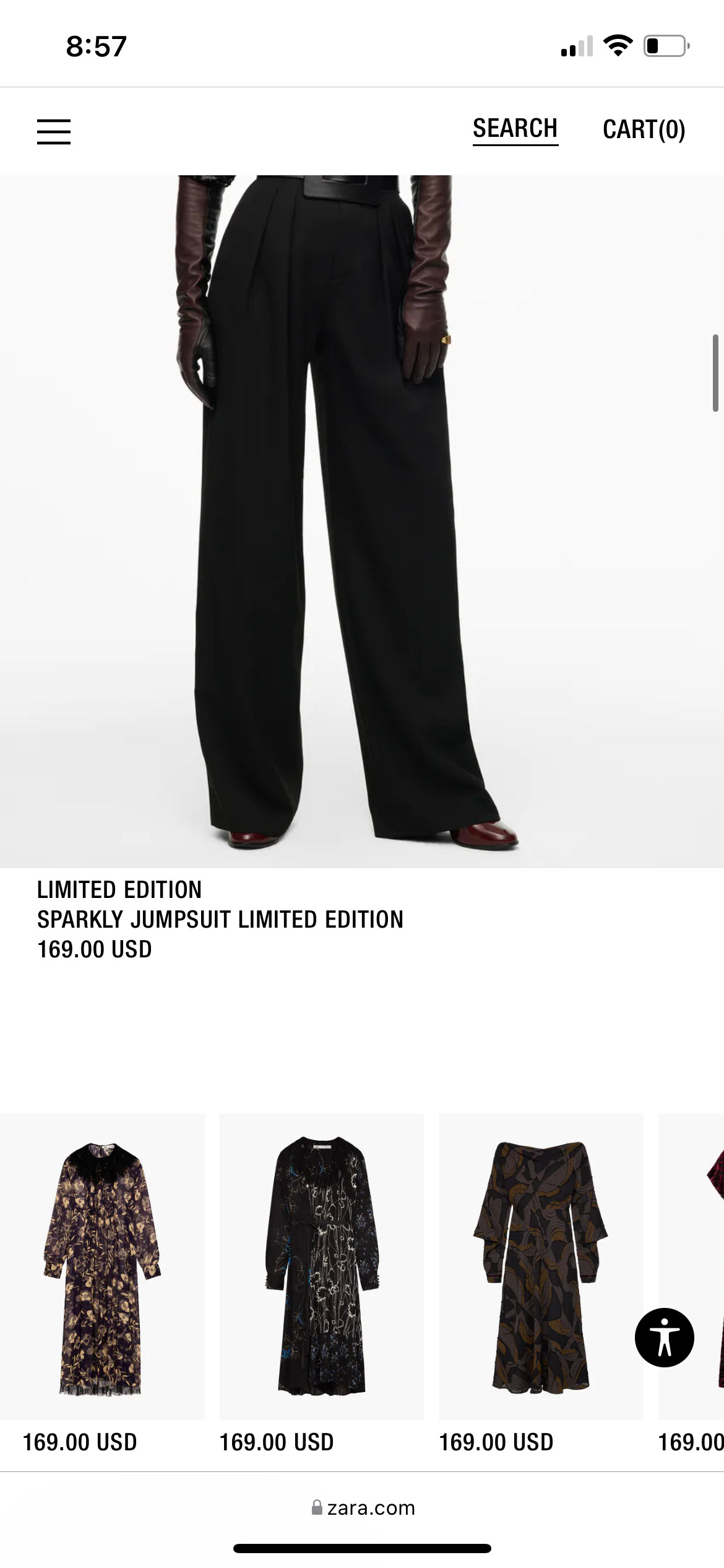
Browsing items is inconsistent. Some items are shown on their own row, some are shown in rows of two, and some are shown in a horizontal scrolling bar.
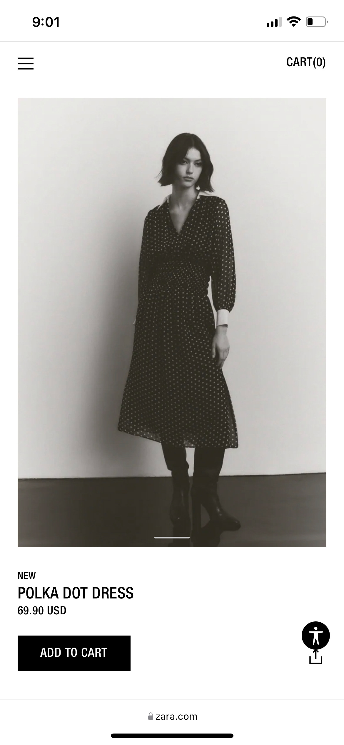
Item photos are not always clear, making it difficult for users to understand what an item looks like.
User Flow Diagram
Before starting to design low-fidelity wireframes, I created a user flow for the primary task of browsing for an item, adding it to the cart, and checking out.
Low-Fidelity Wireframes
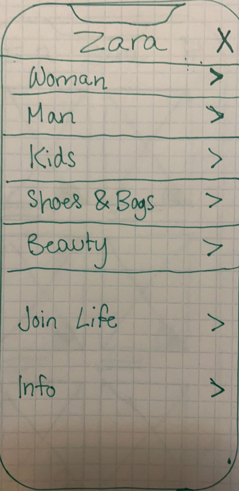
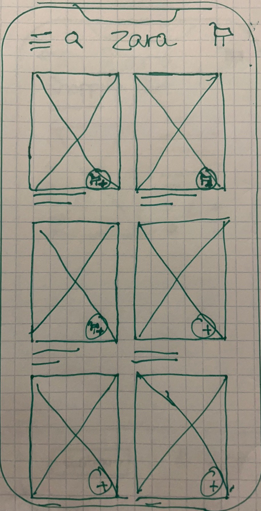
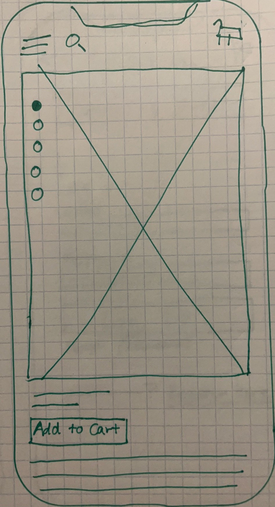
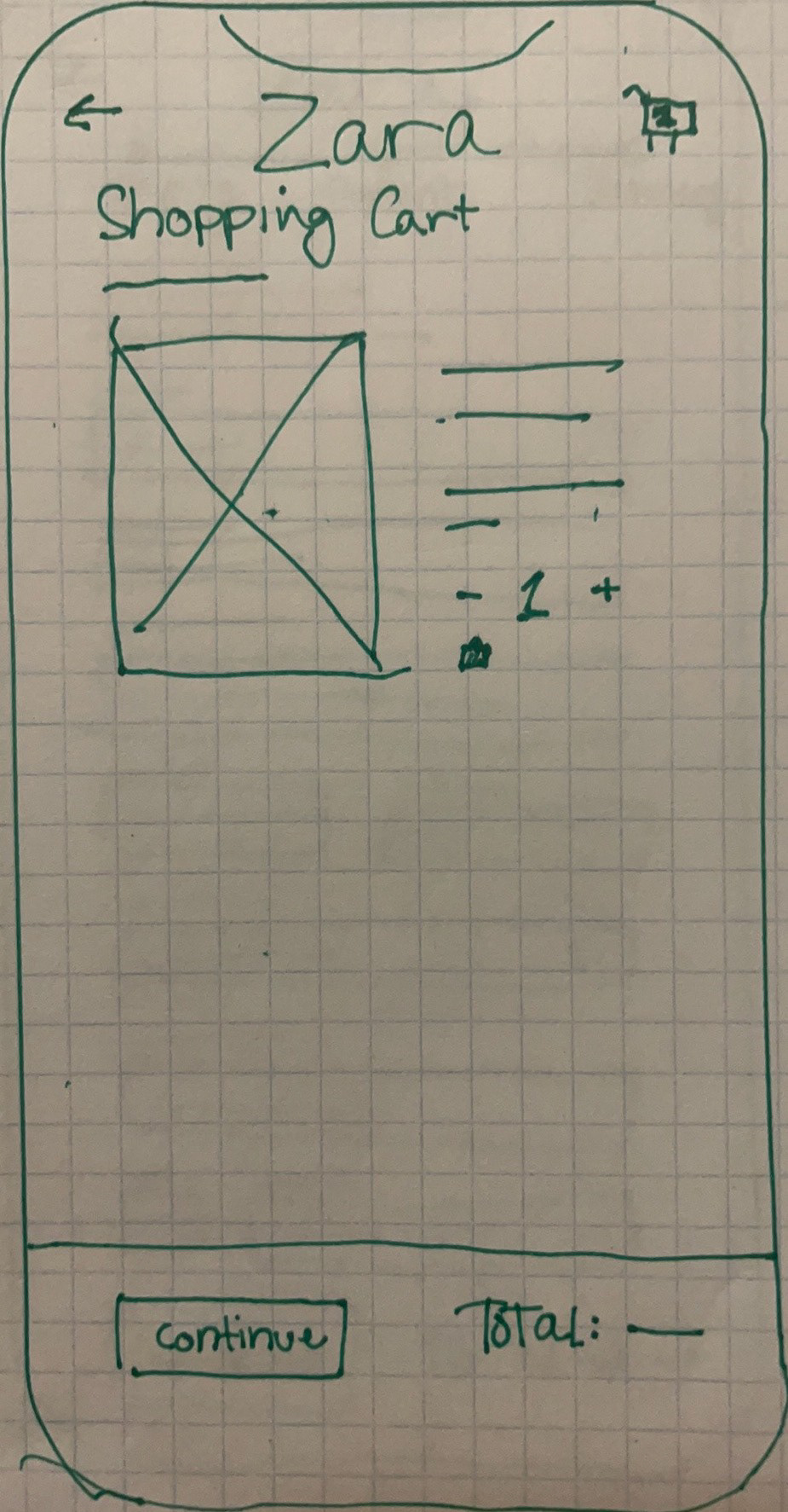
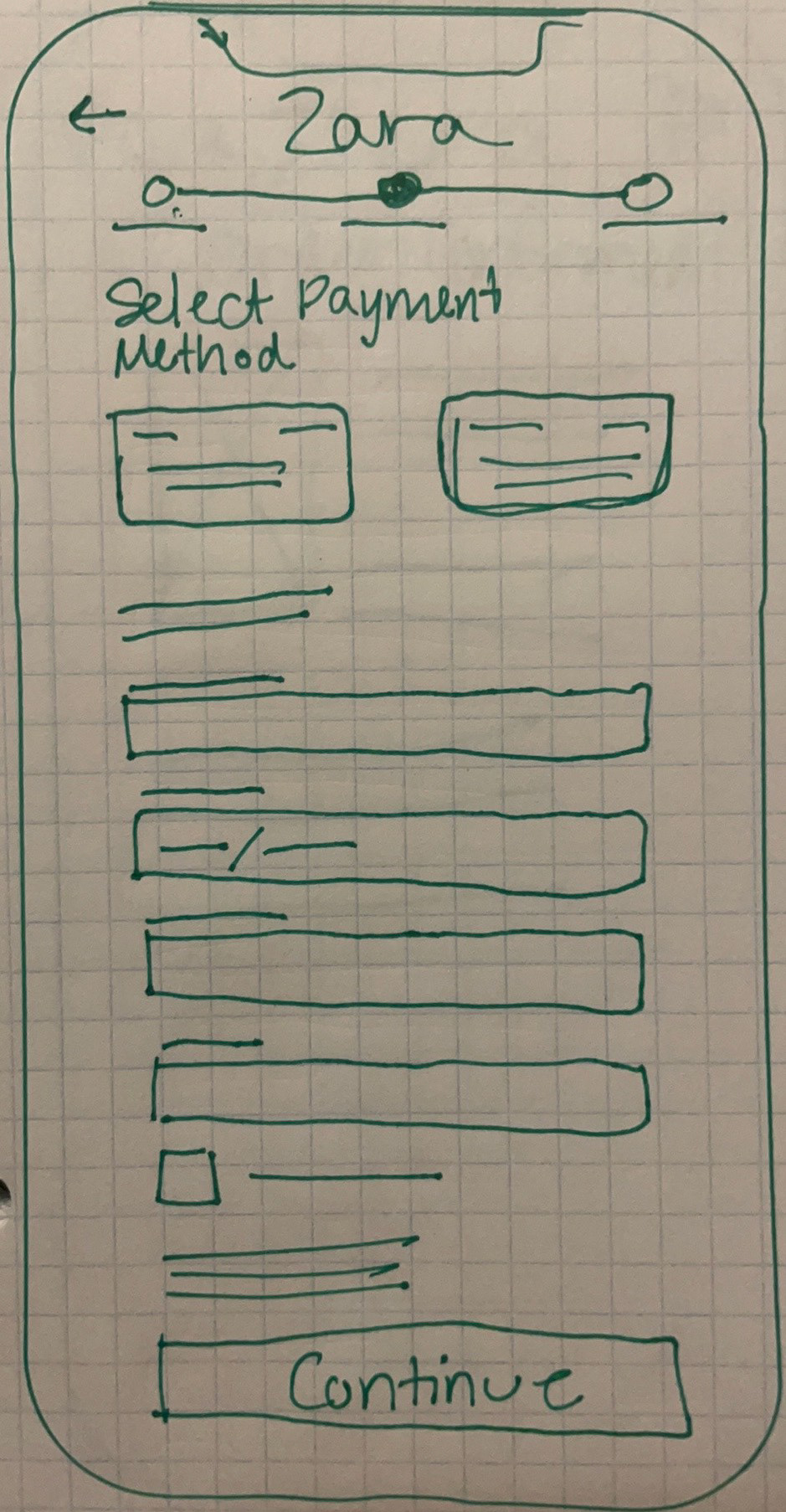
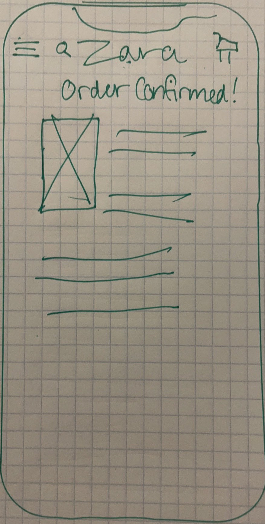
I began designing with paper wireframes. My goal was to keep the designs simple and clean to make for an easy browsing experience.
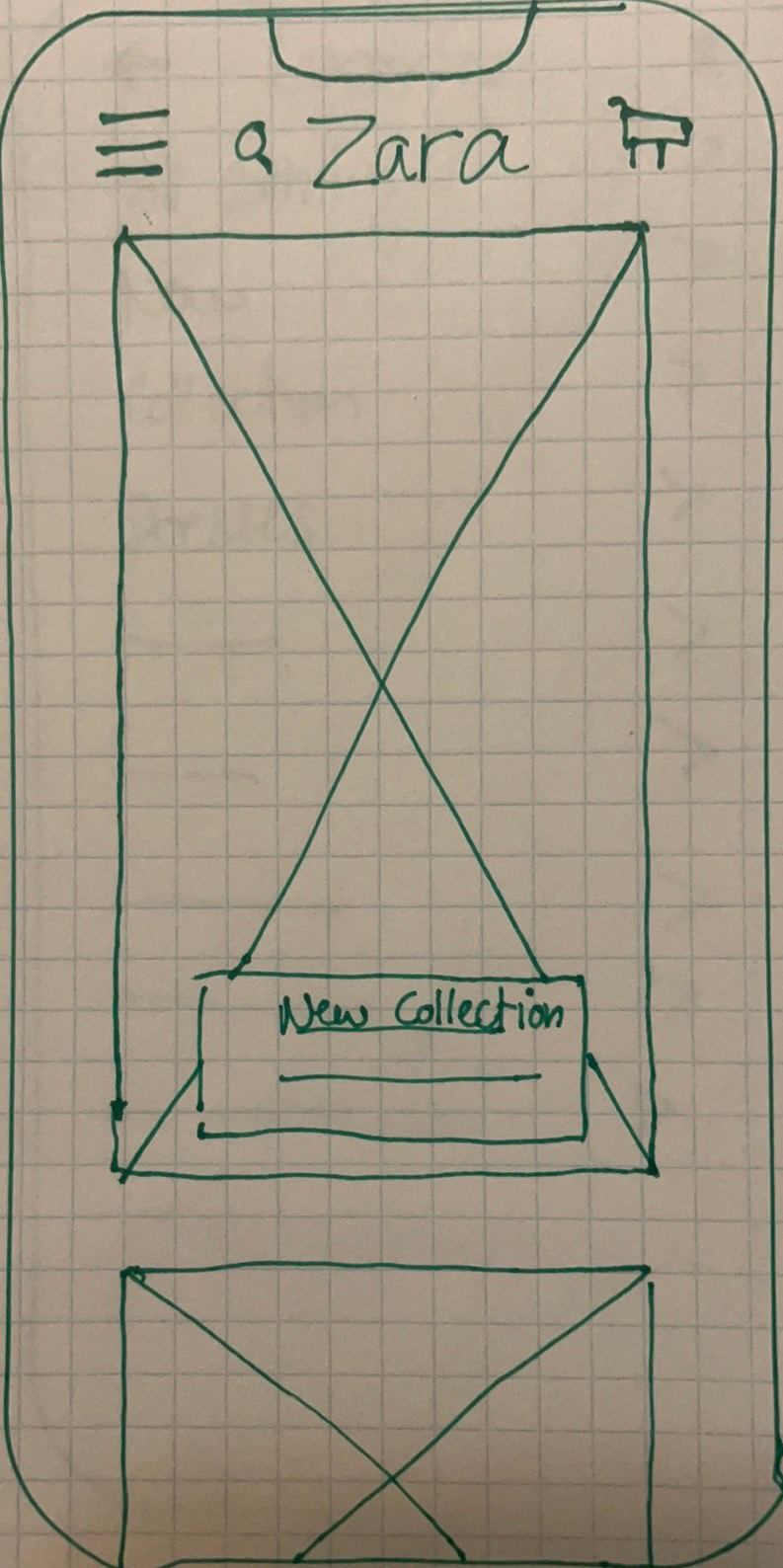
Homepage
Mid-Fidelity Wireframes
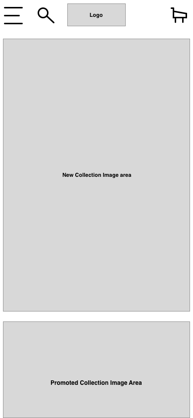
I tested my paper prototype out on three participants in the target demographic and did not run into any usability errors, so I then moved to mid-fidelity wireframes using Sketch.
Homepage
Menu
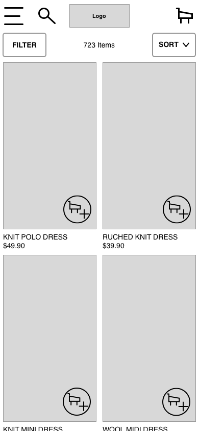
Browse

Item View
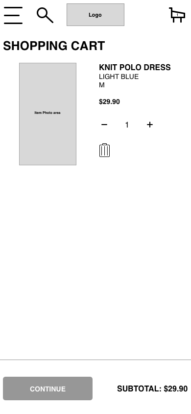
Shopping Cart

Checkout Process
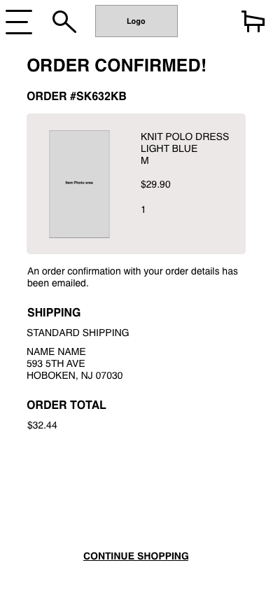
Order Confirmation
Mood Board
This collection evokes young, fun, and hip energy, which is Zara's brand aesthetic. I want the style of the web app to match the fashionable vibe of Zara's products. Zara's ads and style books typically use more muted colors, so I kept in this zone with colors found often in their clothing and photography.
Style Guide
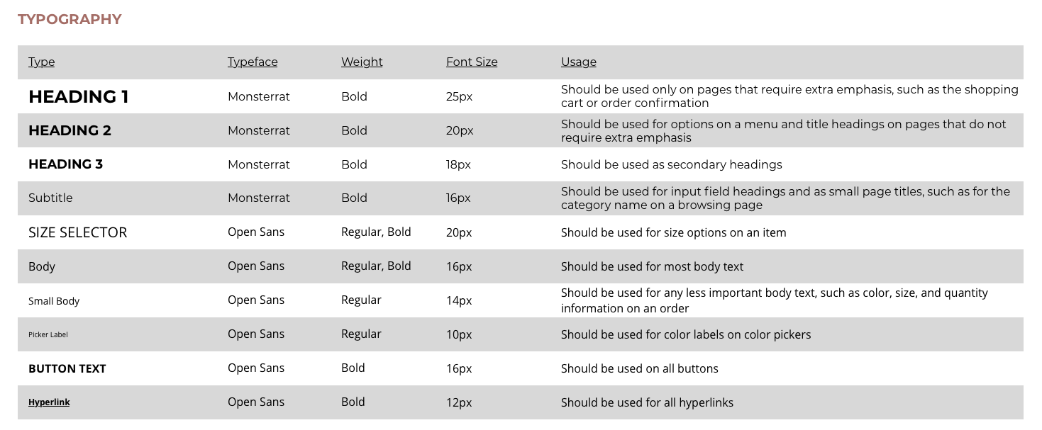
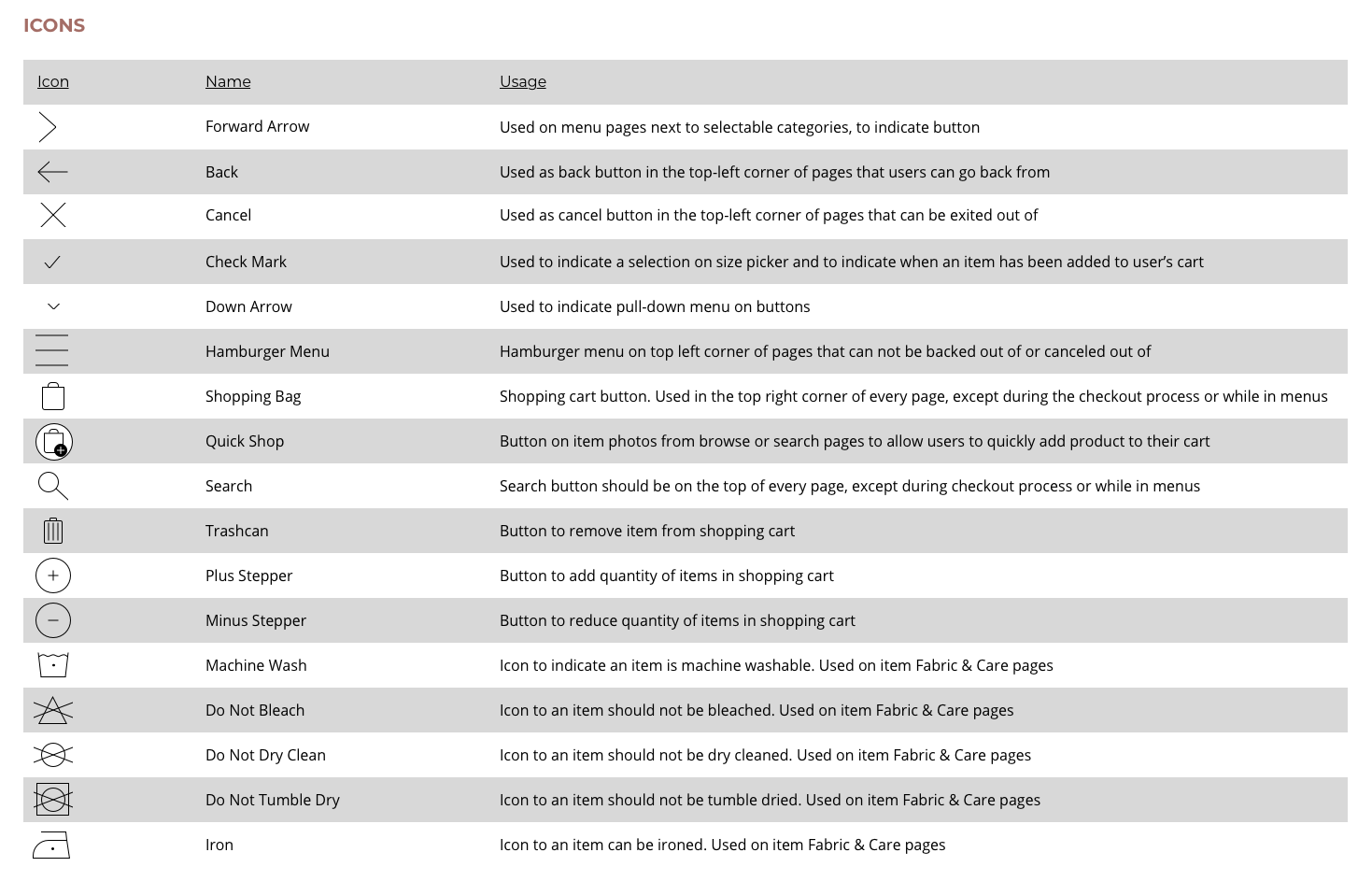
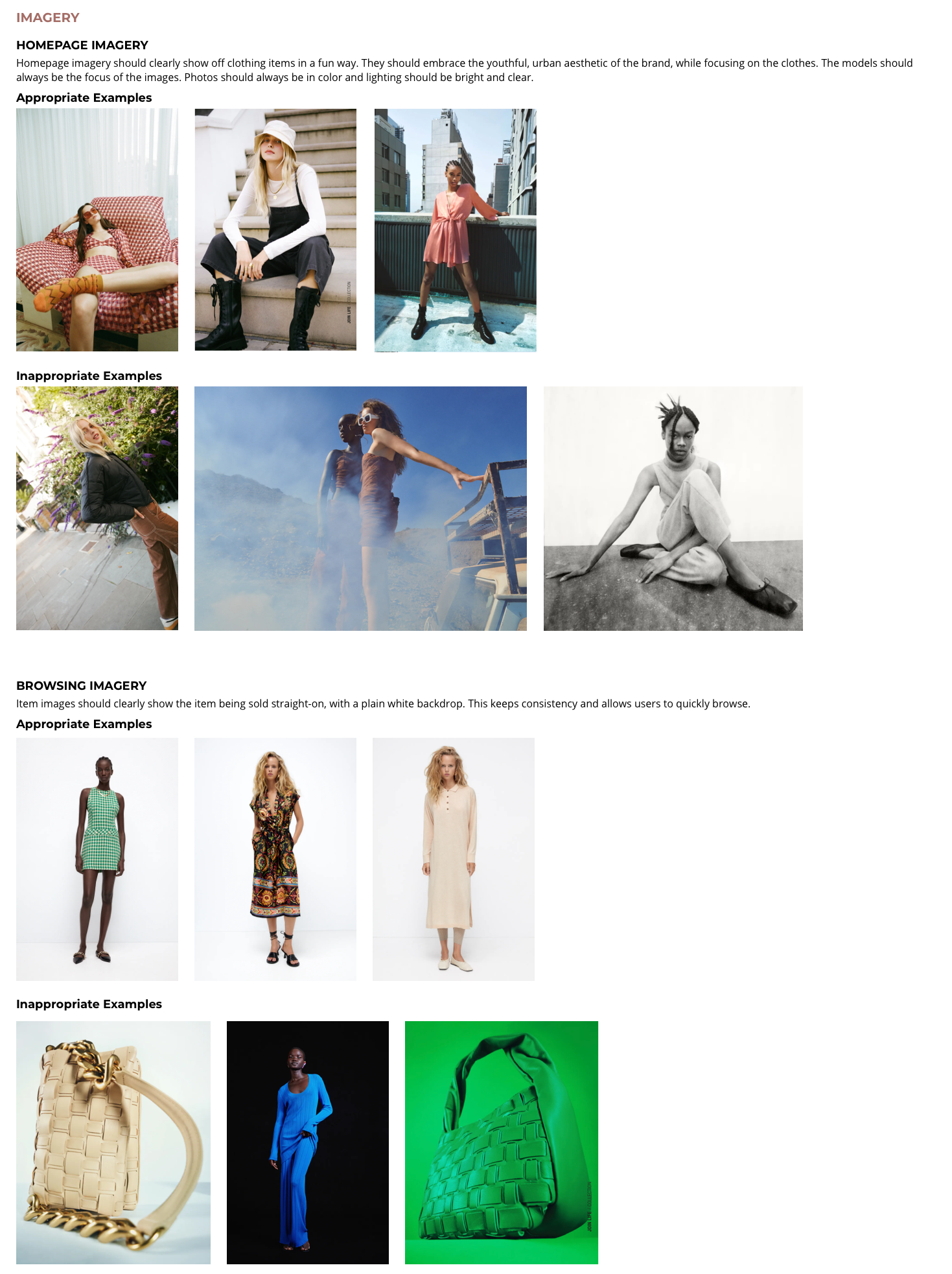
Based on the mood board I had created, I then began making my style guide. I chose easy to read fonts, designed recognizable symbols, and provided guidelines for clear imagery. The color palette is primarily black and white for simplicity, with pink mixed in to allude to modernity and youth, fitting into Zara's brand. Below are a few sections from the finalized style guide.
To view the full style guide, please click here.
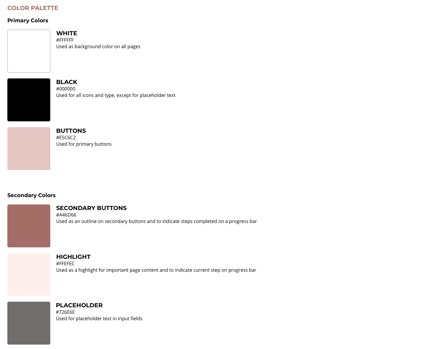
Final Mobile Designs
Design Iterations
After creating my high-fidelity wireframes and animation, I conducted usability testing again and continued iterating my designs. Below are a few of the changes my designs underwent.
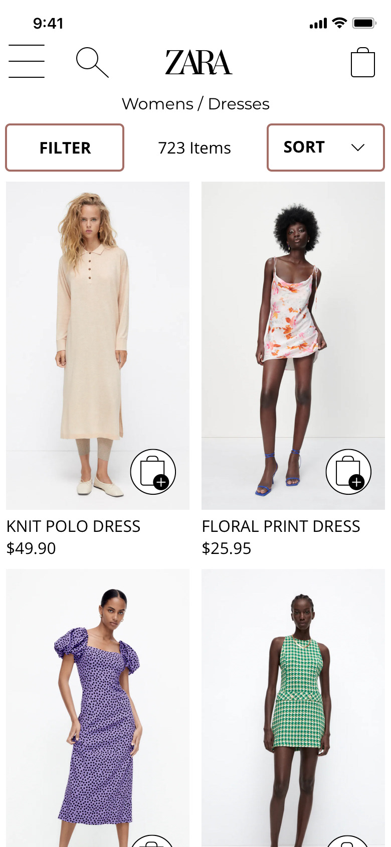
Browsing
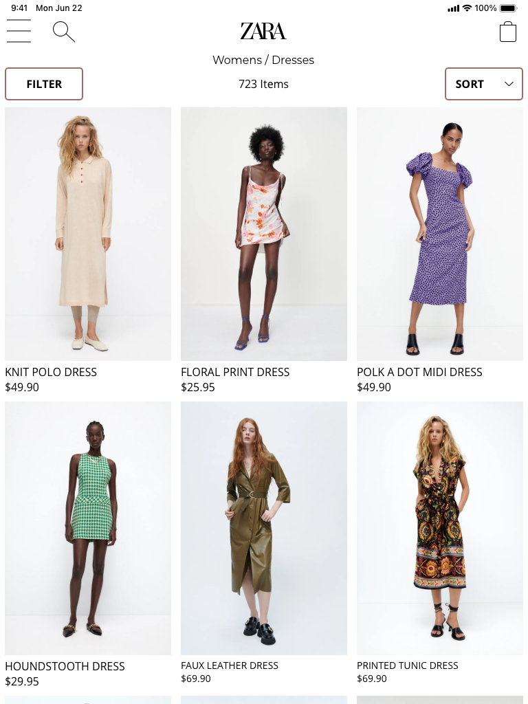
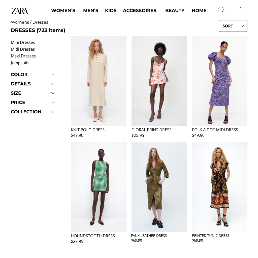
Page title, number of items, and filter and sort buttons were added to the browsing page.




Item View
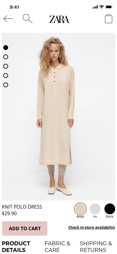
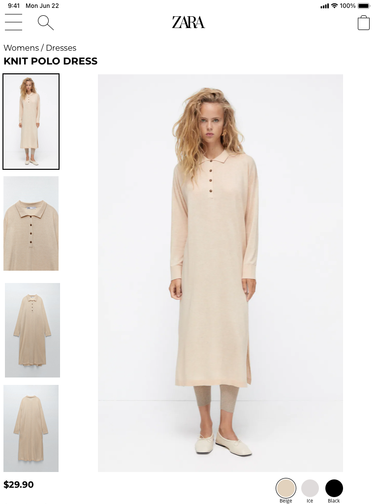
Tabs were added for Product Details, Fabric & Care, and Shipping & Returns to save space and quickly let users flip through information. "Check in-store availability" button was added to allow users the option of picking up an item in-store.
Added to Cart
During usability testing, participants were not immediately certain that an item had been added to their cart and wanted to have the option of going straight to checkout. Because of this, I added a pop-up confirming that an item has been added to the cart and allowing users to quickly checkout.
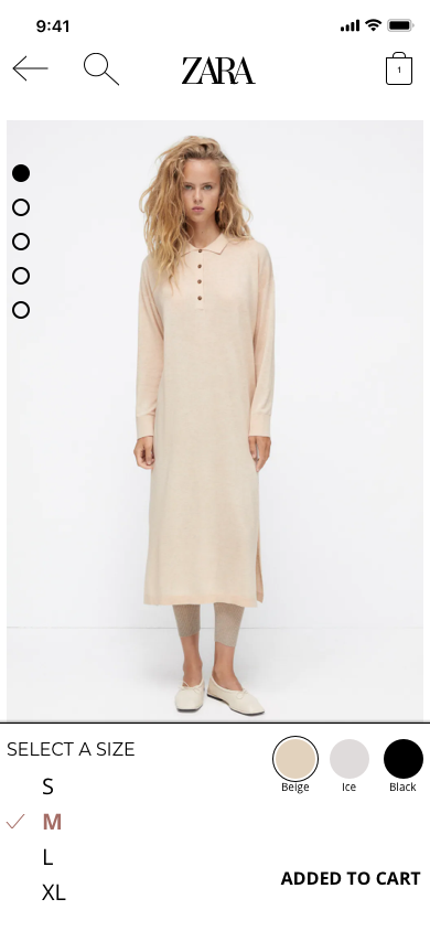


Animation
I created an animation for an item being added to the user's cart, to make for a more fun and lively shopping experience.
Responsive Designs
After finalizing the mobile designs, I then designed for tablet and desktop breakpoints.
Homepage
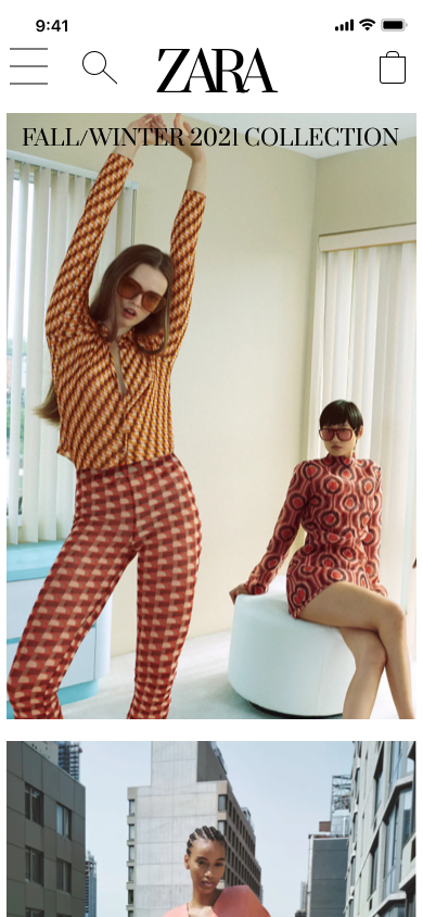
Mobile
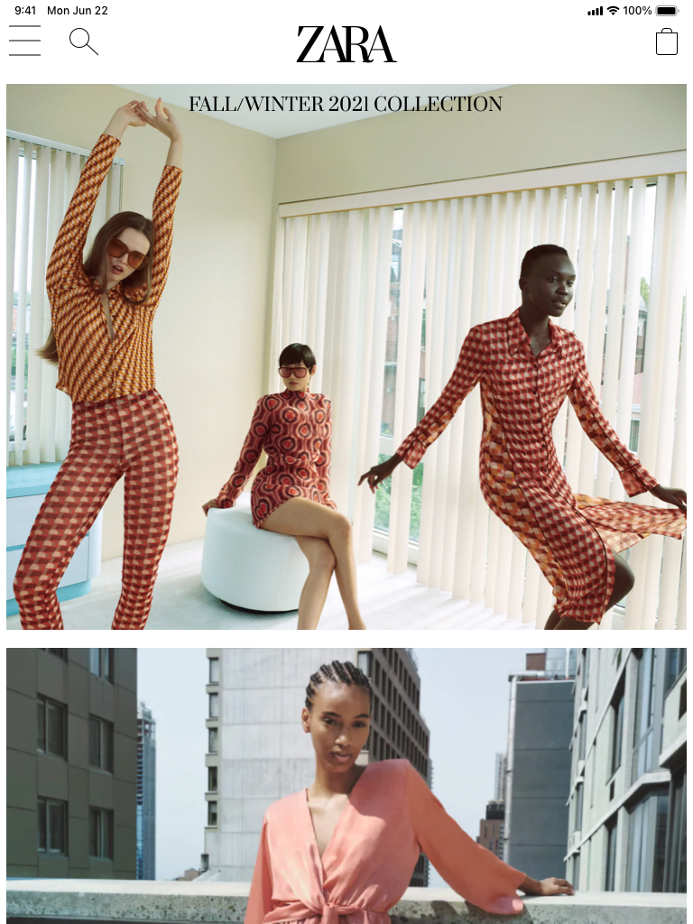
Tablet
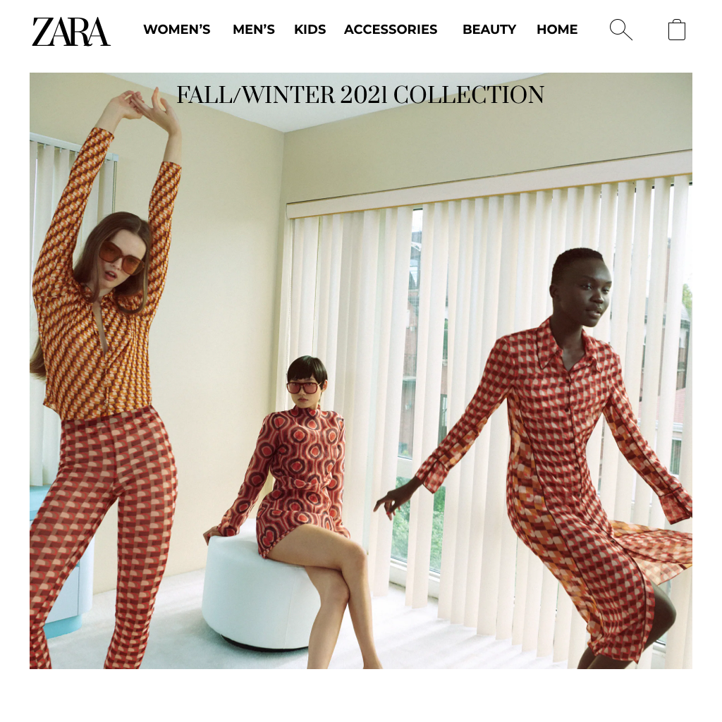
Desktop
Browsing

Mobile
Tablet
Desktop
Item View
Mobile
Tablet
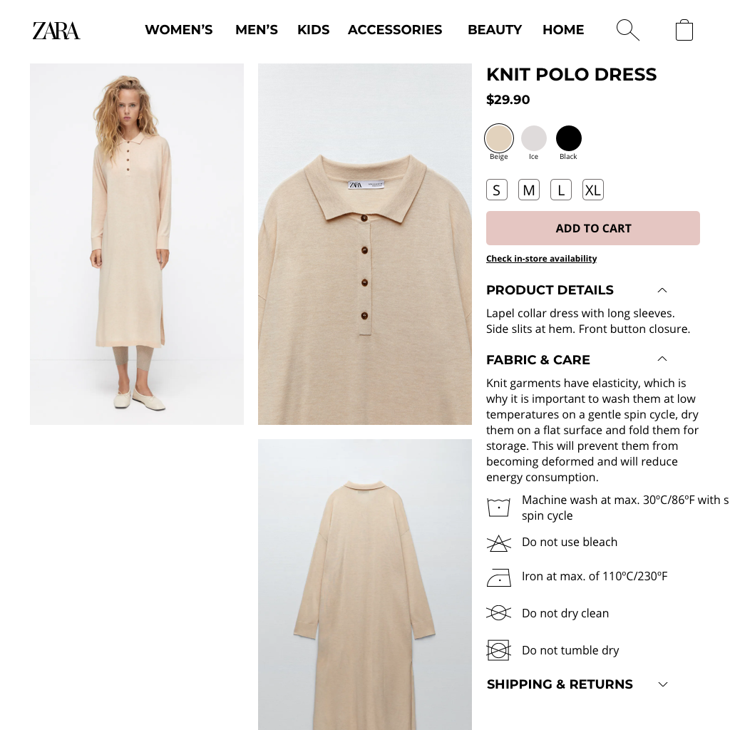
Desktop
Before & After
Side by side comparisons of Zara's official designs and my redesigns.


Homepage
- Search & cart buttons replaced with easily recognizable icons
- Scrolling feature added to view multiple collections
- Image size increased & only images clearly showing off clothing items used
Browsing
- Consistent grid system incorporated
- Filter & sort buttons added
- Quick shop buttons added for each item
- Page title and number of items added to top of page


Item View
- Only clear, colored images on plain white backgrounds used on item pages
- Image pagination added to indicate additional imagery
- Tabs for Product Details, Fabric & Care, and Shipping & Returns added for easy access
Retrospective
Zara's web app was overly complicated, making for a confusing online shopping experience. Going through the redesign process, I simplified the design, kept to a grid system, and incorporated easily identifiable icons.
Lessons Learned
- Simplicity is key for creating a user-friendly and recognizable shopping experience
- Designing with a mobile-first approach is incredibly helpful when creating a responsive web app
- Redesigning an existing product is fun and rewarding!
Next Steps
- Conduct additional usability testing on final mobile designs
- Create prototypes of tablet and desktop versions and test the designs